

Intro
We recently had the chance to work with PlusUK Logistics on all of their digital and offline marketing, including their website, business cards and printed marketing, logo design, and consultancy on branding and even their name.
Brief
As we were brought in at the early stages concerning website and SEO potential, we looked at what worked for competitors in the logistics market. We were asked to think about the name of the company and how it would fit into the current group of business services provided by the parent company.
The timeframe was quite short for the website to be up and running, and we had to complete the naming, branding and logo.
Solution
We started with the name and decided logistics should be in the URL for a few reasons but didn’t want the domain to be too long.
Due to the timeframe that the website and marketing material had to launch, we were working on the website alongside branding and logo development.
Plus UK Logistics is self-contained but also part of the Pluscrates national network. We wanted the name to reflect an affiliation while maintaining its independence.
The Pluscrates brand, for me, has always been about premium service. That is how it was pitched on day one – they wanted to get back to a premium service in the crate hire industry. So to me, the ‘Plus’ meant more, or extra, or above and beyond. And if we break ‘Pluscrates’ into ‘Plus’ and ‘Crates’, it made more sense to keep the ‘Plus’.
While discussing the brand requirements, Neil (Director) mentioned he liked brands that don’t have to mention what they do in the logo – e.g. Argos, Sainsbury’s, John Lewis, and so forth. Plus UK seemed like a good choice.
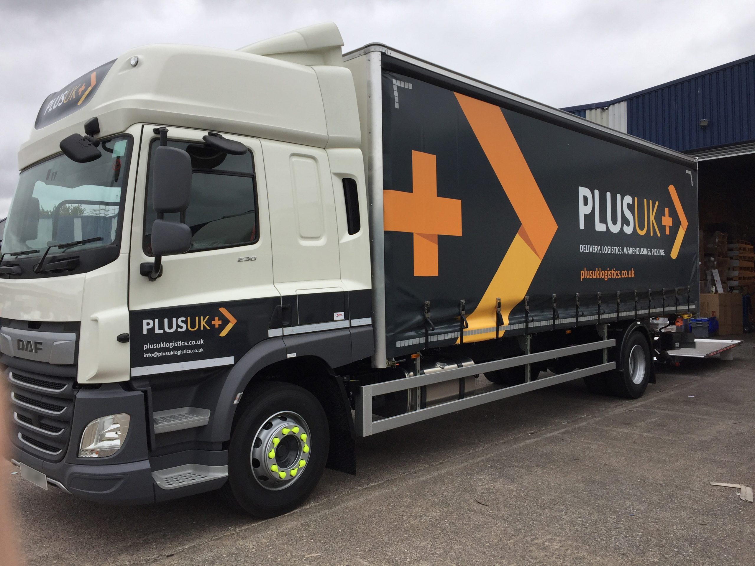
Plus UK was the logo that we developed. We used design axioms that appear in logistics logos to give a new company in the market familiarity. We used an arrow to show movement, and we incorporated the plus icon in the nagative space between the K and arrow.
The negative space between the K and the arrow was spaced so that it would make a square/diamond, and for me, that was a reference to the boxes they would be moving around and the crates of the parent company. And within that box, the plus shows that they go above and beyond in their service.
In the smallest version of their logo used on the website’s ico (bookmark icon in the menu bar), you can see the + and the arrow.
At one point, we used the same shape as the backward K for the arrow. So it is a + and a K or one part of each of the parts of their logo. So even in the logo mark, is still PlusUK
Conclusion
This was a fun and rewarding project – the logo and branding will initially be used on their website and printed materials and later emblazoned on large commercial vehicles. The project manager for the logistics company was Stuart, and everyone was so taken with the logo they couldn’t wait to get it on the side of a lorry.
The fact that Pluscrates has a fleet of vehicles and national depots puts them in a unique position to transition into logistics and delivery.
Plus UK had tremendous growth and success, so we correctly conveyed trust and familiarity with the brand. As much of the team will admit, they grew a little too fast and had a few issues along the way. But the marketing and outreach were all very successful.
We had a lot of creative freedom on this project and could present our creative ideas.