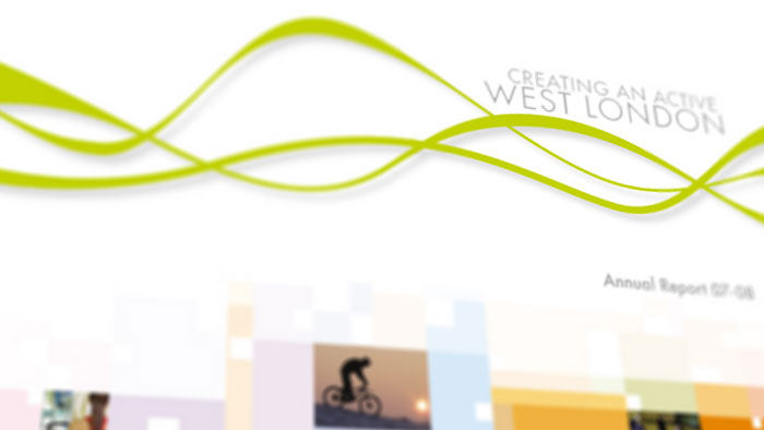
Pro-Active West London Annual Report
Pro-Active West London wanted a design that was fresh and could be used in all their literature. As Pro-Active were already working to a design guide, we had to work along side this to create something new but not too far away from the original and always with
They supplied a style guide but it was quite relaxed with what you could and couldn’t do as it was still being worked on. We looked at how Pro-active wanted to be perceived and started thinking about designs based on activity and sport.
We decided upon the ‘motion lines’ motif that represent a stylised heartbeat, as well as the motion of runners as a simple waveform. The simple design was used to make the booklet cohesive, as the design ran throughout.
