Intro
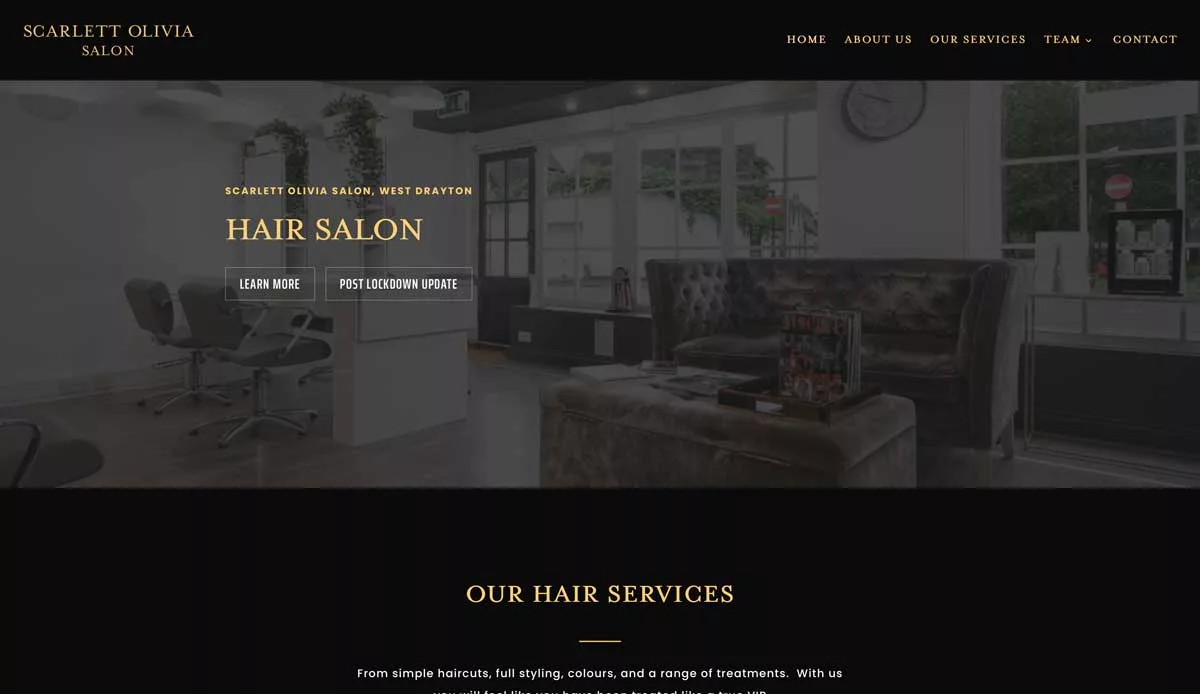
Scarlett Olivia Salon is a local hairdressing salon that provides a modern, relaxing space to be pampered. When we were approached by Scarlett Olivia, they wanted us to produce a modern website that fits their salon’s aesthetic.
Brief
Scarlett Olivia wanted us to produce a modern website that fits their salon’s aesthetic. They provided a lot of information, including what their salon would look like and the chosen fonts and colours that the shop would be branded.
The desire to use a specific font initially worried me due to the limited number of web fonts that are usually available, but we did find a solution (see below). And the chosen colour paint also held some problems.
Solution
When working on the website design, we started with the chosen fonts and colours and started to piece it all together. We used their mood board of websites they liked and tried to distil the pieces they liked into something that would fit together.
The first issue was the colours; as most web developers & designers know, colours can appear wildly different depending on your viewing device. Though most Macs tend to come with some colour calibration, PC gamma can be a lot different. Also, if you turn up the brightness on the screen, the colours can shift and look brighter.
Even though Scarlett Olivia supplied the paint colour and RGB hex code for the colour, they weren’t happy with how light it looked on the screen. We had a few discussions back and forth about sticking with the colour or making it arbitrarily darker, but in the end, they decided not to try and match it to the location’s grey colour and instead go for black to allow the yellow/gold type to really pop and add contrast.
The Problem With Type
When Scarlett Olivia came to us, they had already designed the shop, and it was almost complete. They had a very specific font that they wanted to use. Initially, I was slightly concerned because online typefaces can cause issues.
If the font isn’t widely available and doesn’t exist on the end user’s machine, it can fall back to a second or third font. In CSS, this shows as font families.
font-family: "Times New Roman", Times, serif;
In the above example, you tell the user’s browser to use ‘Times New Roman’, but if they don’t have that, then use ‘Times’; if they don’t have that, use a generic ‘serif’ font. it’s a way to have the font you want first, then define the fonts you will accept if the user’s machine lacks the fonts you want them to see.
The problem with more obscure fonts is they are less and less likely to be available.
Luckily Adobe fonts had recently been updated to allow use on websites with an adobe license. So instead of matching the nearest font, we could license the actual font on the website. So the client was happy, and we didn’t have to compromise on the design.
Conclusion
This was a fun project, and it was nice to work on a darker, modern aesthetic. We look forward to working with Scarlett Olivia in the future.
