ShredPlus – Secure Shredding Website Project
ShredPlus is a secure shredding and confidential waste destruction service provider.
We were asked to design and deploy a website and create a new logo for the brand.
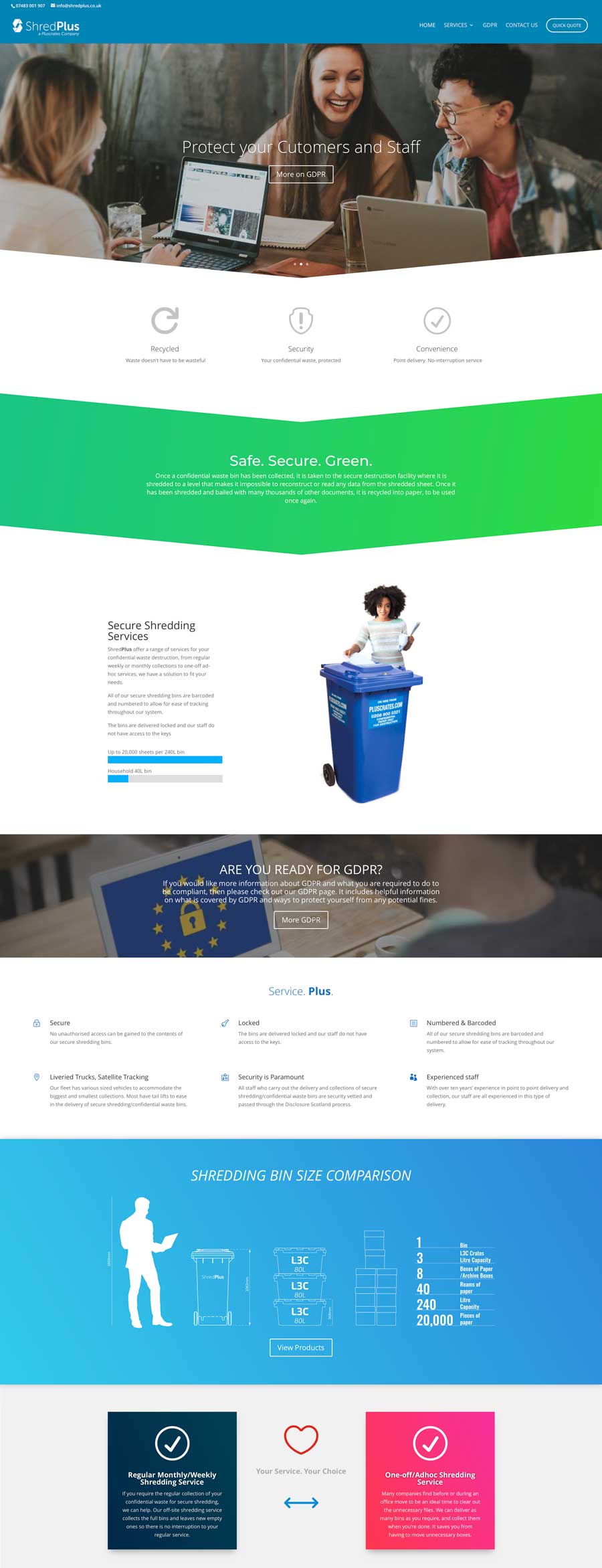
One of the critical points requested was a custom graphic of the secure shredding bins with a relative size compared to a person and various sizes of relevant and recognisable items to many offices, such as paper ream boxes.
The Logo
We designed the ‘S’ of the logo to look like folded paper and two shredding blades to signify paper shredding being the company’s focus. We made a few versions before settling on this one.
The ‘Plus’ in the logo is bolded, showing the importance of service above and beyond other companies and harking back to the parent company.
Consultancy, Brand and Identity
We were asked to brainstorm ideas for names when we first started this project. Working closely with our contact, we would talk about the pros and cons of different names and domain names.
Our thinking is always that shorter is better, and memorable is fantastic.
We thought that having shred or shredding in the domain would give instant recognition to what the company does while adding the ‘Plus’ of the parent company so a familial link.
We began looking into PlusShred and ShredPlus, but the preference went to ShredPlus because there would be no confusion for people that heard the name and typing in the URL how many S’s should be in the middle 😉